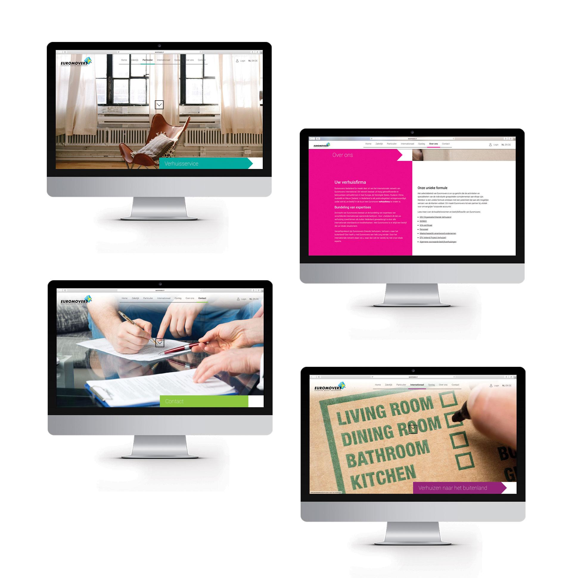
Website
For Euromovers, we, The Dare Company, were approached to redesign their website. They were in need of renewal in several areas. Euromovers wanted to work with different, additional colors and optimize the use of the website for their clients. And so it happened! Our designers got to work with their digital brushes and we took a good look at the User Experience (UX).
Euromovers is a network of highly qualified and reliable moving companies in Europe, USA, Russia, China, Australia and New Zealand. To create a good User Experience (UX) for them, we started by researching the needs of that target group. We kept the results as a focus while designing the ideal UX for Euromovers. After all, the flow of the website is very important for both the brand and the visitors to that website.


Responsive design
The next step had to be taken by our User Interface (UI) designer. He has visualised the interaction design. In the images above you can see what the new website will look like on a desktop. But of course there are also people who visit the website on a mobile phone or tablet. With all the possibilities and different brands of today you have many different screensizes. To ensure that the website looks nice and functions well on every device, the website has been designed and developed fully responsively. This means that the website scales to different sizes, can be used logically and is in line with the needs of the Euromovers targetting group.


